Gringo's Tacos

Coming soon to a parking lot near you in St. Augustine, it's... Gringo's Tacos!!! Look for them very soon...
Award winning logo design from GO2 Media Design. We design and develop brand ID for a range of businesses and products. Make your mark with a professionally designed, memorable logo.
Coming soon to a parking lot near you in St. Augustine, it's... Gringo's Tacos!!! Look for them very soon...
Schooner's Seafood House is THE BEST restaurant in St. Augustine, Florida. Well, ok- we're very partial since they are family. Even still, they do have one of the best menus in town- stop in and see for yourself. We do every chance we get.
We combined some classic illustration sources with some stylish type design to create the familiar logo that represents hearty dinners from the bountiful sea. You can almost smell the salty sea air...
Sam Pacetti is a guitar wizard featuring finger-style playing that is world class. We are blessed to be able to see him regularly in St. Augustine, FL, as well as some other lucky folks around the U.S. and Europe.
Some logos can tell you what they relate to with just a little extra "something". Mohegan Metalworks designs and builds and installs some of the most beautiful iron railings, fences, gates, stairways, and balconies every seen. Their logo gives a strong impression of what they do in an elegant way.

Brand logo developed for the second Austin Powers movie's style guide. Founder Timothy Wood was working for YOE! Studio at the time, the client was New Line Cinema. The logo has been reproduced thousands of times on a variety of licensed items and collectibles.
Designed in the hayday of Internet start-ups and the "dot com" boom in late '99. The background shot is an original photo. "Beat the Street" was based on the Smart Money logotype.
Sound Center Arts provides workshops and events related to the arts and spirituality.
Patient Wear provides innovative garments for patients with limited range of motion and other conditions requiring partial removal.
A clean logo design represents this product with the suggestion of medical or health.
Hemlock Hill Farm is a long standing, working family farm in Westchester County New York. The DeMaria family took their farm online with a website we built for them. As a part of the overall design work we did, a logo was a main component. We worked closely with the client to deliver their vision, and were successful in making something that is warm and welcoming. See it in place on the Hemlock Hill Farm website.

Page Integrity offers the latest in technology consulting for personal and business use. Training, security, software, network configuration, and computer hardware. You won't find a more capable outlet for these services. This logo design reflects innovation, technology, and style.

Award winning brand design from GO2 is available to all clients, big and small. We were very interested in this project as we are very supportive of new fuel and alternate energy resources.
The design represents the transformation from organic green source to the golden energetic burst of color. We also intentionally mixed in some classic (or old fashioned?) industrial style typographic design so the name could also stand alone without the icon in some applications. We rarely render a brand ID but in this case we made sure that this could be converted to flat art without redesigning.
Since our experience includes some industrial design, we are always thinking beyond the computer screen or drawing board.

Our own brand logo. Born in late 2008 in time for the launch of GO2 Media Design, Inc. We wanted to present something fresh and memorable as always but also something that said something immediately to the viewer.
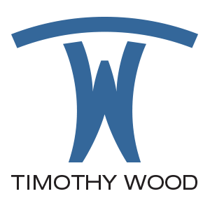
Designer Timothy Wood used a rather traditional typographic (showcard and sign painter, actually) device to fill the open "O" with a dot, at the same time making it a classic "target" symbol. The logotype is based on the Avant Garde typeface.
Babyface Interactive is a provider of software programming and website application development. They are contemporary masters and better than that- totally reliable and dedicated to their work. We should know, they are a strategic partner of ours and have been a part of some of our most succesful websites. We worked with them to create a clean fresh look for their logo; full of character and a colorful flair. We also created an icon as a signature piece to use as a fun little graphic bling. ;-)
FLY stands for Francke The Lyrical Yankee. Our client is a "rhymer" and quite prolific in her writing and rhymes. She has recorded her own debut collection of original work and is actually quite different because she is a senior artist competing in a rather youthful arena. We believe she holds her own as a storyteller and an entertainer.
She chose the classic pen and the sword as symbols in her logo and we added a dash of a hip-hop grafitti style, featuring her favorite hot pink. She is always promoting and very in tune with the latest viral marketing vehicles including CD Baby, Cafe Press, and her own website/blog.
Real estate brokers Pelham Realty came to us looking for help with their presence on the web and their brand identity. We started with their new look which they wanted to be very simple. The final version is bold, shows a bit of perspective suggesting dimension, and is ultimately very simple. We also feel it is quite memorable.
We were hired to design and build an online catalog for Centec Solutions and to create the beginning of their brand. Centec designs and manufactures after market parts and body mouldings for transit buses and some other related equipnment.
We wanted to create a logo that was a logotype combined with an icon. The resulting icon is soon to be a recognizable symbol of quality, value, and reliable service.
We learn every day as we work with new clients and begin to understand their businesses and examine their products. Dramatic Pragmatics Speech and Language Center needed a presence for their new business. We designed this logo and their award winning (2009 Big W) website.
They deal with behaviors, language therapies, and social skills for their clients. We found a font in our research that almost fit. Almost. So we did what we usually do and designed it to fit perfectly into our design for the logo. The design is a fun scene of figures on a stage that spell out the word dramatic. Those little actors can really hold a pose. ;-)
Crystal Ball Records lists over 1,500 titles on their website. When we began with the owners, they had a substantial catalog on E-Bay, but wanted to establish their own presence online. While planning the website that would become their present e-commerce site, we began work on their logo.
We took the image they had been using as a loose guide to what we would create. We wanted to combine typography designed to evoke the mystery associated with with a psychic and imagery that would feel familiar to the audience.
Sometimes a concept is easily portrayed with some very simple imagery, or at least it may appear that way. Even though we made "simple" work for this logo, we wanted to be original, smart, and creative. Memorable for all the right reasons.
Barefoot Acupuncture Center and Medspa is located in Jacksonville, FL. One of the finest medspas in North Florida and a fantastic Acupuncture

The Wellness Center is located in Jacksonville, Florida and provides eastern influenced therapy including accupuncture.
COAST Water Protection Products are some of the most important parts for plumbing that you'll never see. Toilet hardware is important to us all but no one really wants to think about it.
Our assignment was to create a logo for a brand that will rival FluidMaster. We did our research and designed a logo with some very familiar elements, very readable, and finished it off as a memorable iconic shape. Consistency will make this mark a memorable one. We plan to work it into the packaging that will compete for shelf space in stores such as Lowes and Home Depot. Keep watching for it and it's mate, GX3.
Our client knew what she wanted before she walked in the door. Lori Lustig let us know from the start that this logo had to be quite special, of a particular color, and she needed to love it. We combined some straightforward type design with a very contemporary icon that represents the name and the type of business in one fell swoop.
Whew! That may seem overwhelming to some but we thought it sounded like fun and we loved the challenge. We were successful on all levels. We weren't the only ones either, the logo won a Big W Award from the Advertising Club of Westchester in 2008.
How does one build a brand?
We began our work for PRESH medspa by looking at all the truly classic fashion, beauty, and cosmetic brands to see what they had in common. It was a great exercise and we learned some great lessons. Those classics all had two qualities that we felt made them true icons. They were remarkably simple but not plain, yet they had distinct character. None of them were tied to a specific color, they were usually displayed as black or white.
The PRESH brand logo was the first in a series of elements that built the brand.
How do you show movement and nutrition and health all in one image? When you can't portray a concept or business description literally, we feel it is best to get creative, create something new and forget the literal. Let your supporting marketing collateral cover the details. Options in Fitness icon has become a strong identity for the company and should be for a long time to come. That is the goal, to create the image that is memorable and unique.
The church was in need of an identity and we developed this timeless look for them. It combines an existing artwork with some memorable typography.
Greenburgh Public Library logo design was done to accompany their new website design. A playful yet established looking typographic icon was designed that is now widely used as the foundation of their brand.
This is a studio favorite so we keep it around. We also like to show it as an example of some great typography design. It's got a classic feel to it... funny, eh? Well, it is important to us to communicate with images, letters AND words too. Can we really tell an entire story with only one word? It's fun to try.
If you think about it, each letter is a little picture too. Bottom line: we absolutely love to work with typography.

This logo was designed to represent a dynamic drop of sweat. After all, no sweat—no progress. Besides that, it's a memorable image and name, expertly rendered and timeless.

THE GUARD. That's the image for H2O Guard's initial set of products. They represented durability, conservation, and value. The customized armored sentinel was created from many source references and finally rendered as the stylized shield created from a head and chest piece. We originally wanted a stamped look and feel for the typography.

The Fourmen Construction Inc. logo is a throwback to those awesome industrial icons that get embossed into metal. Recognizable yet simple. It's a powerful use of only three letters.
The most credentialed group of doctors anywhere. The Diamond Doctor Society was developed by Dr. Scott E. Newman for the public to be able to find the most credentialed physicians in all fields of medicine. This rendered logo brand is completely original and created digitally.

The SembleTech logo was for a division of an Internet service provider in Westchester county, New York. They began to offer workstations with preloaded software for companies. The image represents "fitting together" in a bold way.

SembleTech Logo was created for a workstation service company. The service involved setting up workstations in business environments and supplying them with software applications to be updated remotely, keeping the entire package current and state-of-the-art. "Assembled Technology" was the core concept.
A logo doesn't necessarily have to be the same all the time. Some may argue. We see the logo to be an opportunity to identify a business or product but why not have some "extra" fun?
Some things, some places, are hard to describe in a single image. So why not use several? We designed the Hendrick Hudson Free Library logo with a revolving set of images, each to represent another service or material. The vertical strokes of the upper case "H" were perfect for supporting each image acting as the horizontal stroke or "cross bar" to form the letter. It works well, it's fun, and there are many other fun images to use.
Spiritual Java was a unique program of yoga and nutrition developed by Marilyn Diamond, Co-Author of the visionary 70's mega-bestseller, Fit for Life.
This brand ID was a composite of one original photograph (the hand), an original illustration (the jewel), and the typographic icon "SJ" within the jewel image.
The "G" and "Z" Wheels logos were designed for a company that sold custom wheels. The company has since hit the road but we're collectors of classic works, so we keep these in our trophy case. It's fun to take them out to show every once in a while and rev them up.
The folks at DockLink have a great idea for delivering wireless internet to marina members. To begin their marketing efforts they chose to create a logo as the basis for the brand. We were happy to help out and were successful in creating a unique icon and logotype.

E-Recruiter logo. A start-up in the hey day of the dot com boom. To our visionary credit, this was prior to Apple introducing the iMac. (lol)
ReInvent Business needed something that was contemporary yet not over the top. The ribbon element represents the unwinding of traditional business and marketing. It also took on the familiar "e" to represent the new "electronic" medium.
We started as Timothy Wood Design LLC in 2001 and evolved into GO2 Media Design, Inc. in 2009. This is our original mark.
|
"You did a great job on the AEESP web site..." |


